October 2018- January 2019
The Well Raise Foundation project showcases my expertise in nonprofit UX design, focusing on user engagement, seamless donation experiences, and volunteer participation. This case study serves as a demo representation of my ability to strategically design for nonprofit organizations, addressing their unique challenges and optimizing digital outreach.
Due to confidentiality constraints, I cannot showcase real client projects on my portfolio, but this detailed case study highlights how a human-centered design approach can drive impact in nonprofit organizations.
For this project, I focused on creating an intuitive and visually compelling digital experience that enhances key aspects such as:
Donation Mechanisms – Streamlining the process to make contributions effortless.
Community Engagement – Encouraging interaction through compelling storytelling and event participation.
Volunteer Services – Providing clear calls to action for individuals interested in contributing their time.
Fundraising Initiatives – Ensuring nonprofits can communicate their mission effectively and increase donor retention.
Through a data-driven UX research and design process, I developed an email campaign strategy that not only increases donations but also strengthens donor relationships and expands volunteer engagement. By implementing compelling messaging, personalization, and strategic content placement, the design encourages meaningful interactions and long-term support for the organization’s mission.
This project stands as a testament to the power of user-centered nonprofit design, showcasing how thoughtful UX strategies can drive donations, enhance engagement, and maximize impact in the nonprofit sector.
The goal of the research was to enhance Well Raise Foundation’s email marketing to drive donor engagement, increase volunteer participation, and grow the donation structure. We explored ways to optimize the process of subscribing, personalizing messages, and creating impactful campaigns that would engage both donors and volunteers. We also sought to identify pain points in the existing donor experience, using user interviews and feedback to understand expectations.
We employed a mix of qualitative and quantitative research methods. Qualitative methods included user interviews, which provided in-depth insights into donor and volunteer needs, behaviors, and expectations. Quantitative research, such as analyzing past donation trends and open/click-through rates, helped us identify patterns and optimize future email marketing campaigns.
Our target audience consisted of existing and potential donors and volunteers for the Well Raise Foundation. This included individuals who had previously contributed to fundraising campaigns or shown interest in supporting the foundation’s causes. The audience also included those who follow the organization on social media and could potentially be converted into active supporters.
From our research, we learned that personalized content, easy access to donation options, and clear calls-to-action were the most effective in driving engagement. Donors preferred personalized messages that spoke to their past contributions and emotional appeal. Volunteers were more likely to engage with content that included event invitations and clear volunteer opportunities.
The journey mapping process helped us identify the key touchpoints for potential donors and volunteers, including signing up for newsletters, engaging with content on the email, and making donations. We also mapped the user’s path from receiving an email to completing an action, such as donating or signing up for an event.
The main issues identified were a lack of personalization in email content and difficulty in accessing donation links. Donors were not always aware of the impact of their contributions, and volunteer opportunities were not highlighted enough in previous campaigns. We needed to address these issues by creating compelling, targeted email campaigns that drove action.
During brainstorming sessions, we explored various strategies to engage the audience more effectively. Some key ideas included integrating social media sharing options, simplifying donation processes, and using compelling narratives about the foundation’s impact. We also considered providing options for supporters to select their preferences regarding the frequency and type of content they received.
We evaluated ideas based on their feasibility (e.g., ease of integration with the existing email system), viability (e.g., budget considerations), and desirability (e.g., donor preferences). Key features such as personalization, clear donation calls-to-action, and social media sharing were deemed highly desirable and viable.
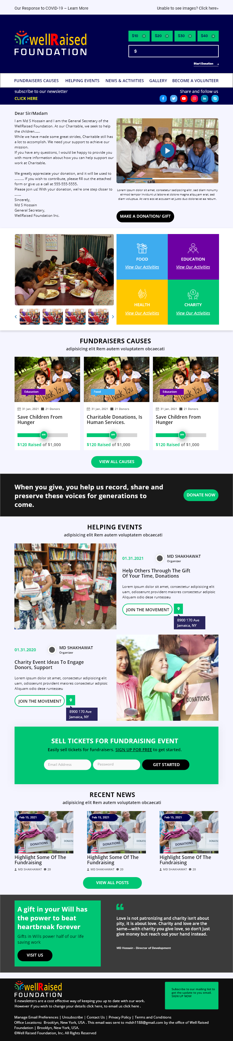
Purpose: Sketching allows for the rapid exploration of different layouts for the email campaign. It’s a low-fidelity way to conceptualize the content hierarchy, placement of CTAs (Call-to-Actions), and important sections like donation buttons, social media share buttons, and event details.
Process: A quick, hand-drawn or digital sketch is created to experiment with the email’s overall structure. This includes sections for compelling messages, personalized content, event invitations, and thank-you notes.
Outcome: Sketches provide a simple blueprint of how the email will be structured and allow for quick iteration. It helps visualize the flow of the email and where key actions should occur to maximize user engagement.
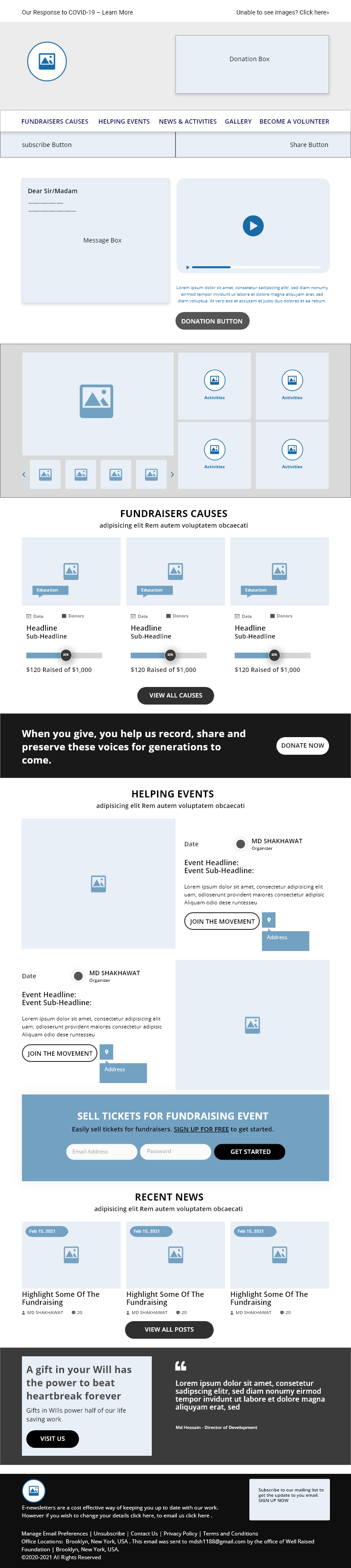
Purpose: Wireframing takes the concepts from sketching and translates them into a more refined, digital structure. For the Well Raised Foundation email, wireframes map out the layout of each section, including the header, main content area, CTAs, footer, and social media links.
Process: Using tools like Figma or Adobe XD, wireframes are created to define the exact placement of elements without focusing on design aesthetics like colors or images. The wireframe will show the placement of key components like the newsletter sign-up form, donation buttons, volunteer engagement links, and the call-to-action for events.
Outcome: A wireframe gives a clearer, more detailed view of how the email will look and function, ensuring that important content (like donation appeals, event invitations, and thank you emails) is prioritized and easy to navigate.
Usability testing involved analyzing how easy it was for users to subscribe to the newsletter, navigate through the email, and take action (e.g., donate, volunteer). We tested different email layouts, subject lines, and calls-to-action to find the most effective combination. Feedback from testers revealed that the simpler the email design, the more likely users were to follow through with donations or volunteer sign-ups.

Growing Donor and Volunteer Base: We placed the subscribe button in easy-to-access spots and integrated social media sharing options to increase reach.
Expanding Reach: Personalized messages and event invitations were incorporated to connect with donors on an emotional level.
Compelling Messaging: We crafted messages that clearly communicated the organization’s mission and impact.
Simplified Donation Process: Direct donation links and easy access to donation options were placed strategically within the emails.
Thank You Emails: Acknowledging donors’ contributions with personalized messages showed appreciation and highlighted the impact of their support.
By implementing these strategies and improvements, Well Raise Foundation’s email marketing campaign will be more engaging, efficient, and impactful. This will lead to increased donations, higher volunteer participation, and stronger relationships with supporters.